A room-by-room guide to picking colors based on the mood you actually want, not just what’s trending.
Most color guides show you a palette and tell you it’s trending. Few explain why a color makes a room feel a certain way, or which shade actually fits the mood you’re going for in a specific room. Color psychology closes that gap — it’s the study of how hue, saturation, and undertone affect mood, energy, and focus, and it’s the reasoning behind why 2026’s most popular interior colors (smoky greens, warm terracottas, espresso browns) aren’t just aesthetic choices. They’re emotional ones.
Why the Same Color Can Feel Different in Two Rooms
A common frustration: someone paints a room a color they loved in a photo, and it feels completely wrong once it’s on their own walls. This isn’t random — it usually comes down to a few overlooked factors:
- Lighting direction — north-facing rooms cool a color down; south-facing rooms warm it up.
- Room size — dark, saturated colors read as cozy in small rooms but can feel heavy in large, low-ceiling spaces.
- Undertone — a “gray” with a blue undertone reads cold, while one with a beige undertone reads warm, even at a glance.
- Surrounding materials — the same green looks earthy next to wood tones and cool next to white marble.
Color psychology gives you a framework for predicting these effects before you commit to a full gallon, instead of learning the hard way after the paint dries.
Warm vs. Cool: The Foundation of Every Palette Decision
Warm colors (reds, oranges, yellows, terracottas)
Warm tones raise a room’s perceived energy and temperature. They tend to make large or sparse rooms feel more intimate, and they’re strongly associated with sociability — which is why they show up so often in kitchens, dining rooms, and entryways, where the goal is warmth and welcome rather than calm focus.
Cool colors (blues, greens, some grays)
Cool tones lower perceived energy and tend to slow the eye down, which is why they’re the default recommendation for bedrooms and home offices. The 2026 shift toward smoky, muted versions of these colors (rather than icy, bright ones) reflects a broader move toward tones that feel soothing without feeling cold or sterile.
Color-by-Color: What Each Shade Actually Does
Sage and olive green — calm without going cold
Green sits at the emotional midpoint between warm and cool, which is part of why it’s dominating 2026 palettes. It reads as grounded and restorative rather than stimulating, making it one of the safest colors for rooms meant for rest: bedrooms, reading nooks, and living rooms where you want calm without starkness.
Terracotta and clay — warmth that doesn’t overwhelm
Unlike brighter oranges, terracotta and clay carry enough brown undertone to feel earthy instead of energetic. It works well in kitchens and entryways specifically because it welcomes people in without demanding attention the way a saturated red or orange would.
Smoky blue-green — focus with softness
This muddier, muted version of blue-green is one of 2026’s most-cited colors for a reason: it keeps blue’s calming, focus-supporting effect while avoiding the flat, sterile feeling of icy pastel blues that dominated a few years ago.
Espresso brown — grounding and sophistication
Deep brown has moved from an accent color to a primary wall color in 2026 palettes. Psychologically, brown reads as stable and secure — it’s the color equivalent of solid ground, which is why it works particularly well in dining rooms and libraries, spaces meant to feel substantial rather than airy.
Muted rose and plum — comfort without sweetness
Older, icier pastel pinks are fading out in 2026 in favor of dustier, muted rose and plum tones. The muting matters psychologically — a chalky rose reads as comforting and intimate, while a bright, saturated pink can feel more youthful or high-energy, which isn’t always the mood a bedroom or powder room is going for.
Mustard and ochre — energy in small doses
These warm yellows are strongly associated with optimism and energy, but they’re intense enough that most designers recommend them as an accent — a door, a piece of furniture, trim — rather than a full-room wash, where they can quickly tip from cheerful to overstimulating.
Quick-Reference: Color and Mood by Room
The infographic below summarizes each color family, the mood it creates, and the rooms it tends to suit best.
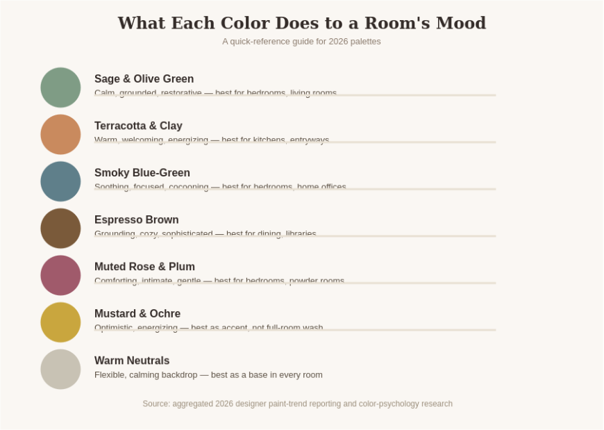
Not sure where to start? Pick the one room where mood matters most to you right now — usually the bedroom or living room — and test a single accent wall before committing to a whole-room repaint.
How to Choose a Color for the Mood You Actually Want
- Want the room to feel calmer? Start with sage green, smoky blue-green, or a warm, muted neutral.
- Want the room to feel more social and welcoming? Terracotta, clay, or a warm ochre accent works best.
- Want the room to feel more grounded and substantial? Espresso brown or a deep olive does this without going cold.
- Want the room to feel softer and more intimate? Muted rose or plum, especially in low-traffic spaces like bedrooms.
- Not sure yet? A warm neutral base gives you room to test bolder accent colors through textiles before committing to paint.
Common Color Psychology Mistakes
- Choosing a color purely because it’s trending, without considering the room’s lighting or existing materials.
- Painting an entire small room in a stimulating color (bright mustard, saturated red) and finding it overwhelming after a few weeks.
- Ignoring undertone — testing a swatch in a store’s fluorescent lighting instead of your own room’s natural light.
- Assuming one “right” palette exists for a whole home instead of matching each room’s color to its actual function.
Want our free color-and-mood cheat sheet with specific paint recommendations for every room? Subscribe below and we’ll send it to your inbox.
Frequently Asked Questions
What color makes a room feel the calmest?
Muted, smoky greens and blue-greens are generally considered the most calming, since green sits at a psychological midpoint that reads as grounded rather than stimulating, and muted blue-greens soften blue’s coolness without feeling sterile.
Does color psychology in interior design actually have research behind it?
Color’s effect on mood and perceived temperature is well documented in environmental psychology, though individual response also depends on personal association, culture, and context — which is why testing a color in your own room’s lighting matters more than following a trend list exactly.
What’s the best color for a home office to support focus?
Cool, muted tones like smoky blue-green or sage tend to support sustained focus better than warm, high-energy colors like bright orange or red, which are more stimulating than most people want for deep work.
Should every room in my house use the same color palette?
Not necessarily. Many 2026 designers recommend matching each room’s palette to its function — warmer, social tones in kitchens and dining rooms; cooler, calming tones in bedrooms and offices — while keeping one or two neutrals consistent throughout to tie the home together.
Are dark colors a bad choice for small rooms?
Not automatically. Dark, saturated colors can make a small room feel intentionally cozy and enveloping rather than cramped, especially with good lighting layering — the concern is more about ceiling height and natural light than square footage alone.
Color is one of the few design decisions that changes how a room feels every single day, not just how it looks. Choose based on the mood you want a room to support, test it in your own light, and let the psychology guide the trend — not the other way around.